Google just wrapped up I/O 2026 , including a ton of new AI tools designed to help you spend less time on the hard stuff and more time creat...
Amazon Payment Services releases Research on Generation Z Attitudes toward Digital Payments (Infographic)
Amazon Payment Services, a regional leader in digital payments across the Middle East and North Africa (MENA) region, shares research on th...
OPPO Ranks among the Top 10 PCT Filers Worldwide for the Second Consecutive Year (Infographic)
OPPO celebrated the 21st World Intellectual Property (IP) Day, summing up the latest progress it has made in respecting and protecting int...
Communication Strategies to Rebuild Tourism & Hospitality Industry Post COVID-19
The travel, tourism, and hospitality industry suffered devastating effects since the onset of the Covid-19 pandemic, with the UN’s World Tou...
Snap Inc. releases the Snapchat Generation study for MENA Users (Infographic)
Snap Inc. has released a new study highlighting how Snapchatters in KSA are adopting new behaviors and values that are changing the world t...
77% Consumers are Shopping More Online in Saudi Arabia Since the Start of Pandemic, Reveals Mastercard Study
As the global COVID-19 pandemic continues to spur e-commerce, a Mastercard study has revealed the rapid growth of online shopping, with near...
30 Years of World Wide Web - An Infographic by Cisco
World Wide Web (WWW) has completed 30 years now and we have seen numerous changes in these three decades in every aspect of life due to the...
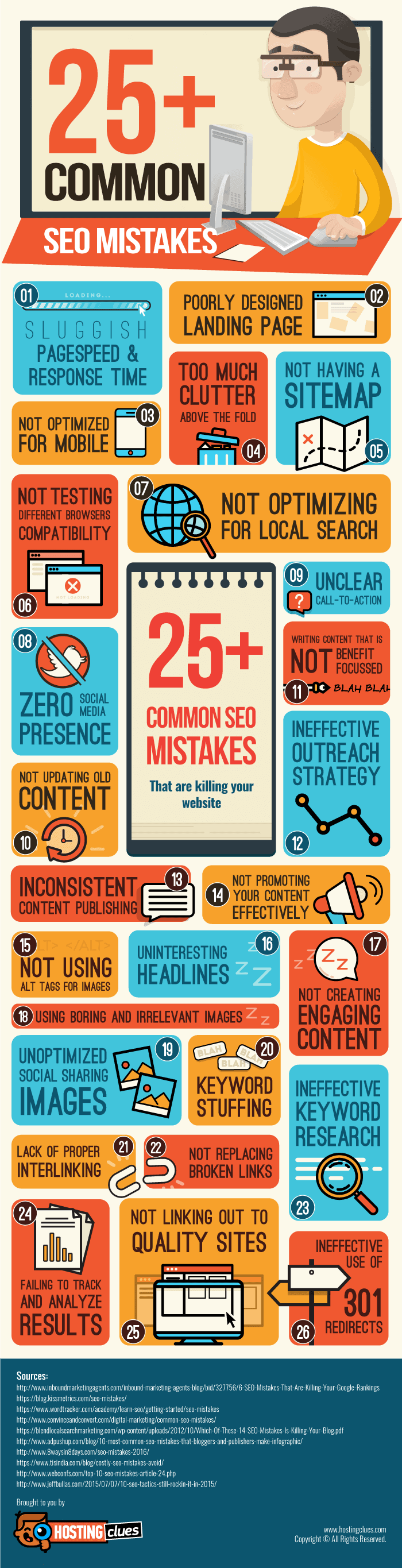
Top 25+ Common SEO Mistakes To Avoid (Infographic)
SEO , short for Search Engine Optimization , is one of the key factors influencing the overall success of your online website. You need to f...
How Loading Speed Affects Your Website (Infographic)
Website speed has become a hot topic in recent years. As the internet evolves, the techniques for building websites develop with it. It’s 20...

The Top 10 Blogging Commandments (Infographic)
Blogging is unique because with little or no experience you can grow it into a full-fledged business in a relatively short amount of time. I...
The History and Evolution of Google Smartphone from Nexus to Pixel Devices (Infographic)
With Google shiny new Pixel 3 series of smartphones being launched, we felt it would be great to turn back into the pages of history and ha...
Transform Your Smartphone into a Mobile Office With These Apps (Interactive Infographic)
Nowadays, almost everything is possible with the help of mobile apps. For example, you can edit photos and videos, book flights and hotel rooms, find delicious recipes, learn foreign languages and the list goes on. Business people weren't left out either. Since business apps are the most lucrative ones, therefore plenty of innovations take place in this category of apps. Most often than not, these are all apps that can make the lives of business people stress-free and drastically improve their work productivity.
You probably hear word productivity wherever you go and on every corner, right? It's completely normal since just like mobile apps, word productivity also grew in its popularity. It is now used by everyone, from big company CEOs, basketball players, formula 1 drivers all the way to professors, accountants and investors.
But, what does it actually stands for? It can stand for a lot of things, every industry is interpreting it in its own way but. However, there is also one widely accepted definition: it is a measure of the efficiency of a machine, person, system, engine, factory, etc., in turning inputs into valuable outputs. When we think of our own productivity or the productivity of our employees, we usually think of how much we or they can achieve in one day or hour.
In the business world, productivity is measured exactly the same the only difference is the metrics we use. They can differ from one industry to another, and they can be all kind of things like a number of closed deals, contracts signed, emails send and so on.
Usually, people are most productive when they are in their own traditional work environment like their office spaces. If they would like to stay productive while traveling, the only option is to use some clever and innovative mobile apps. This is why business people are the big fans of productivity mobile apps. Most of those apps allow them to bring their work and even the whole offices with them on a business trip.
This is why we decided to share with you one really interesting interactive infographic made by people from Cometdocs. It will show you what mobile apps can completely replace your traditional office equipment like sticky notes, printer, and documents cabinet. Just click on the blue dots in order to find out what app replaces the selected office element.
Best Smartphone Apps for Business and Productivity (Interactive Infographic)
Since the first smartphones were introduced to the market, mobile apps have grown tremendously in their popularity. Actually, the whole in...
The History and Evolution of the Samsung Galaxy Note Smartphones (Infographic)
The Note 8 had curved edges and long 18:9 display with minimal bezels which oozed quality and style. Switching up its game, the Samsung Galaxy Note 8 housed dual cameras of 12 MP each (a first for Samsung).
Incorporating many features and with upgrades to the existing features, Samsung’s Note 8 has managed to revive the Samsung Galaxy Note series. Despite the losses faced by the smartphone giant, Samsung has managed to hit back with a better and more advanced version of the Note series. Letting go of the old bulky and standard design the company used for the Note series, Samsung Note 8 hits well with the Note lovers and users.
But the Note 8 which was one of the most popular phones for Samsung, is now replaced by the Galaxy Note 9. The Note 9 comes with an all new improved stylus with Bluetooth compatibility, a brighter display and a much larger 4000mAh battery. With each new launch, it's always great to reminisce the past, and to do just that, Hometop came up with a cool infographic that looks at the history and timeline of the Samsung Galaxy Note smartphones right from the very first Galaxy Note in 2011 all the way to the Note 9.
The History and Evolution of the Samsung Galaxy Note Smartphones (Infographic)

Wanna Embed This Infographic in Your Blog Post? Copy and Paste the Code Given

[Via: Geeky Stuffs]
After the catastrophe that was the Galaxy Note 7 , Samsung created the Galaxy Note 8 . Aimed to improve Samsung's fortunes after the Not...
Which is the Best Smartphone Fast Battery Charging Technology? - Comparison of Fast Charging Standards
While fast charging is a great solution to a genuine problem, a small issue that arises from it is there are too many standards. As a famous internet meme goes, every manufacturer aims to reduce the multiple standard mess by launching a new standard which eventually adds to this mess.
A look at the infographic from Hometop shows a lot of standards for fast charging which simply add to the confusion. But we are looking beyond the mess today, to find the fastest charging standard in the smartphone market currently available.
USB Power Delivery (USB-PD) aims to reduce all this clutter by providing a single standard that works for all devices from smartphones to laptops that charge via USB-C. What's really good is some of the largest manufacturers like Apple, Google and even Qualcomm are using the USB-PD standard for better uniformity. But the Pixel 2 XL is probably not the best example of USB power delivery as it uses lesser power than the charger can provide. But for future devices, USB-PD seems to be the way forward.
Qualcomm's Quick Charge has been around for a long time and has a much wider reach due to most smartphones today using a processor made by Qualcomm. But Quick Charge 4.0, their latest iteration is slowly beginning to appear on devices and will take some time before we see phones use the full standard. But as a standard, Quick Charge is better supported even by third-party vendors that create a lot of chargers and power banks using the Quick Charge standard.
But what's the use of talking about fast charging if we are not going to talk about the fastest? So what do you feel is the fastest? Obviously, OnePlus Dash Charging right? Well, No. If you look at charging times and charging rate from Hometop's super-cool infographic you can see Huawei's Super Charge marginally beating Dash Charging.
It manages to charge at a rate of 46.57mAh/minute compared to 41.25mAh/minute of OnePlus’ Dash Charge. So we finally have an answer to which is the fastest charging standard currently, it is Huawei's Super Charge found on the Huawei P20, P20 Pro and the Honor 10.
So have a look through the infographic and let us know what you feel about the fastest charging standards and the slowest ones in the list.
A Detailed Comparison of Smartphone Fast Battery Charging Standards (Infographic)

Wanna Embed This Infographic in Your Blog Post? Copy and Paste the Code Given

[Via: Geeky Stuffs]
Humans and smartphones are like bread and butter- they are inseparable. The smartphones of today are so advanced that we are dependent on t...
OnePlus : The Journey to Six and Complete History (Infographic)
But with OnePlus turning 5 soon, we thought of turning back the clock and revisiting the older OnePlus devices to see how unique they were at their times. The team at Topcut.in created a cool infographic that illustrates OnePlus' journey from the One to the 6, so have a look at the infographic at the end of the article.
In almost 5 years of its existence, OnePlus has had a rather small lineup of only 8 phones, pretty small considering brands like Samsung and Motorola launch that number in a single year.
OnePlus' journey began with the OnePlus One, a phone that was as popular as it was different at its time. For $300 it shouldn't have been as good as it was. Its 5.5 inch Full HD screen, Cyanogen OS, 64GB storage and Snapdragon 801 were usually found in flagships twice its price. With such top-notch features at such an affordable price, OnePlus sold almost a million units. It was from that time that the term Flagship Killer was coined and attributed to the OnePlus One - a term still in use today.
The OnePlus 2 brought a lot of changes. It started the AMOLED screen trend that is still existent on OnePlus devices. There was a 4GB RAM variant and it had the latest Snapdragon 810 processor. The phone was amongst the first with USB Type-C and fingerprint sensor.
But with the overheating processor, screen issues and poor software support, the OnePlus 2 wasn't the best OnePlus we had.
Not happy with only flagship killers, OnePlus wanted a share of the budget-mid range market as well. This led to the introduction of the OnePlus X. A phone sold almost at the same time of the OnePlus 2. The OnePlus X was just a OnePlus One with an AMOLED screen and microSD card support. Being just slightly cheaper than the OnePlus 2, the OnePlus X didn't do too well and future versions of it were scrapped.
Until the OnePlus 3, all OnePlus devices were sold in an “invite-only” sales model. A lot of people couldn’t get their hands on it. But with ample time and manufacturing experience, OnePlus finally launched the OnePlus 3 via open sales. The OnePlus 3 was massively popular and loved by critics. It had a lovely metal body, powerful yet thermally cool Snapdragon 820 processor, a great screen and best of all Dash Charging; OnePlus' proprietary fast charging which was also the fastest at its time.
Within 5 months of the OnePlus 3 launch, OnePlus pulled a fast one on the Oneplus 3 owners by launching an updated OnePlus 3T. The 3T had a more powerful Snapdragon 821 processor, a larger battery, higher resolution front camera and a larger 128GB storage option. This mid-cycle update did not go down well with many of their fans and OnePlus was severely criticised for this move.
Shortly after the OnePlus 3T came the OnePlus 5 another much anticipated phone that delivered the goods. It had a powerful Qualcomm Snapdragon 835 processor, dual cameras and again a great price. People loved the OnePlus 5 so much it became one of the fastest selling OnePlus phone ever. Not quite done with launching phones, OnePlus got the OnePlus 5T to market - a mid-cycle update to the OnePlus 5. It had a larger screen, a repositioned fingerprint sensor and a different camera sensor. While it wasn’t that major an update, the 5T gained popularity due to the Star Wars edition.
With that, we come to the OnePlus 6 the latest and greatest in OnePlus' lineup. The OnePlus 6 is off to a great start in terms of sales and critics’ reviews, there are however rumors looming about a 6T coming in Q4 of this year.
So do let us know what you think of OnePlus' journey and your thoughts on the OnePlus 6. Also, share your OnePlus experience and comment on which OnePlus you think is the most important one.their latest model - OnePlus 6.
The Complete History of OnePlus ( Infographic )

The OnePlus - a device with flagship-like specifications, premium design, and low price - has always wowed users around the world. OnePlus ...

The Anatomy of A Perfect Landing Page ( Infographic )
And this reason for this is simple.
As a goal-oriented page, a landing page is aligned with your marketing campaign. Here, you highlight a single goal that you want your visitors to undertake - be it signing up for a demo, providing emails for free eBook download, amongst others. Thus, as there is only one single action on any given landing page, it helps limit distraction and reduces bounce rate, leading to a higher conversion.
However, while creating a landing page for your business is an easy task, ensuring your landing page brings the required traffic, on the other hand, can be tough if it is optimized for conversion. All successful landing page comprises of basic elements that are a must-have in order for it to capture the audience attention and boost revenue. Therefore, if you want to know what these key elements are then here is an infographic that can help you out.
This landing page infographic will show you precisely how to build a landing page that helps garner targeted leads. It will also help you steer clear of common landing page mistakes that can hurt your bottom line. Comprising of 11 best practices, this infographic is all that you need to create a perfect landing page that helps boost your ROI.
To give you a glimpse, here are the key landing page elements that this infographic covers
- Pick the right colour scheme.
- Write an attention-grabbing headline.
- Include a clear call-to-action (CTA).
- Write concise content that highlights the benefits.
- Keep your form field short and simple.
- Ensure that the lead capture form is placed above the fold.
- Don’t distract your visitors with too many links. Keep it minimum (1-2 links).
- Add relevant images and multimedia.
- Add social proof and trust symbols.
- Include genuine customers/clients testimonials.
- Don’t forget to run an A/B split test on your landing page.
These are the basic elements that are essential on all landing pages As such, to learn more about these elements, go ahead now and take a look at this infographic right away!
The Anatomy of a Perfect Landing Page [Infographic by LeadForest]

One of the best ways to generate quality leads and increase conversion of your website is to create a landing page. As a single goal-oriente...

50+ Website Maintenance Tips for a Well-Optimized WordPress Site ( Infographic )
However, once you start a WordPress blog or a website, you need to ensure that it is up-to-date at all times if you want to yield lasting results from it and as such, here is a full list of ongoing WordPress website maintenance tasks that you need to undertake, in order to provide your audience with a great user experience.
A well-optimized WordPress website can help you garner more organic traffic as well as higher ranking on SERPs, thus take a look at this website maintenance infographic below and implement the tips to make your site healthier & robust.
The entire infographic comprises of 50+ actionable website maintenance tips that can help you boost your site conversion and ROI and to give you a glimpse here are some best practices for maintaining your site effectively.
Also Check :
WordPress 101 : The Complete WordPress Checklist and Guide (Infographic)
A Handy WordPress Essentials Guide for Every Business & Industry (Infographic)
1. Ensure that your WordPress plugins, themes and widgets are up-to-date. Also, make sure to eliminate unwanted plugins and themes from your database.
2. Optimize your Images as well as Database to improve your website’s speed and performance.
3. Review your site’s content and ensure that is fresh and up-to-date at all times.
4. Check your site’s speed and loading time with tools like Pingdom and Google Pagespeed Insights.
5. Check and Redirect broken links, in order to prevent high bounce rate.
6. Clean up the trash, spam comments and other junk media files to improve your site’s functionality.
7. Scan your website daily for any vulnerabilities and fix these issues immediately.
8. Review your site’s download, social media and affiliate links, in order to avoid Google penalty.
9. Review your site’s on-page SEO factors. Also, always take a daily backup of your entire site and database.
Now, take a look at this infographic, download the PDF guide for future reference and start optimizing your website right away!
WordPress Website Maintenance Checklist (Infographic) - 50+ Essential Tips and Practices

We can all agree to the fact that WordPress is a powerful CMS that can help you build an amazing website. It is free, secure, flexible and ...
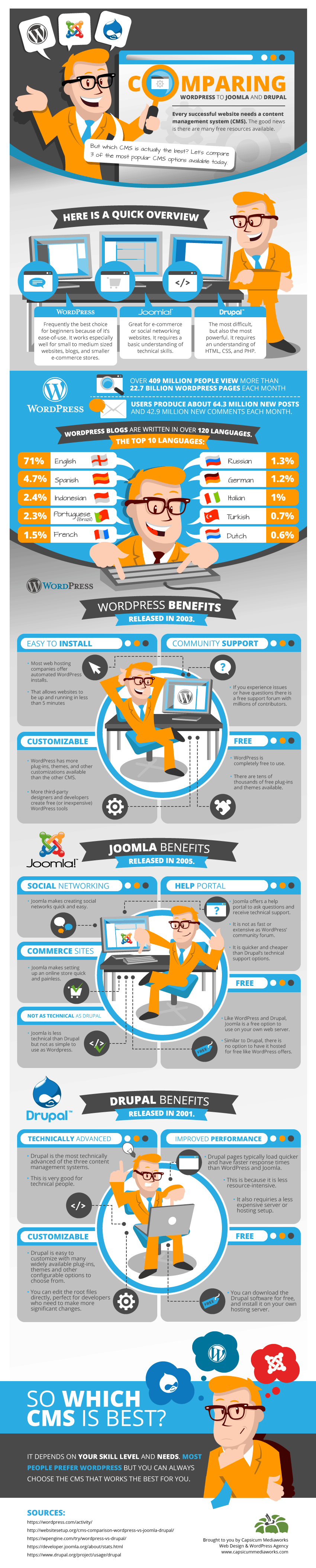
WordPress vs Joomla vs Drupal - Which One You Should Choose? (Infographic)
All of these 3 CMS are wonderful in their own right and share a few commonalities, the major being that they are free to use and open-source. They are also mobile-friendly and each has a large community support that can help you resolve any technical problem or answer any of the queries that you may have regarding your website.
Also Check : How to Check if Google Considers your Website as Mobile Friendly
However, they do have certain differences that set them apart from each other.
WordPress, for instance, is the most easy-to-use CMS and provides you with a wide array of features that makes it easier for you to run and maintain your website. Its major USP lies in the fact that one doesn’t require an extensive knowledge of PHP and other scripts to work with this CMS. Moreover, it offers you an abundant of WordPress themes. Plus, you can add extended functionality to your website through the use of WordPress plugins.
The next popular CMS after WordPress is Joomla. This too offers you a wide range of themes and add-ons. However, unlike WordPress, to run a Joomla website you require a bit of a knowledge about PHP and other scripts. Apart from this Joomla is an easy to use CMS that comes with a lot of customization options. In addition, it is flexible, which means, you can create any type of website you want with this CMS. But, mostly, Joomla is used to create eCommerce websites and Social Networking sites.
Drupal is the third most downloaded CMS and though it is more technically advanced than WordPress or Joomla. It is also one of the toughest to work with as it requires you to be skilled in PHP, HTML, and perhaps even Python. Offering you a number of themes, add-ons and plugins, Drupal can be tricky CMS to develop and as such, if you looking for an easy to use and manage CMS than it is probably not a right platform for you.
There are more such differences between each of this CMS highlighted in the below WordPress, Joomla and Drupal infographic by the team at Capsicum Mediaworks, LLP. Thus, if you are looking for a CMS to build a website then take a look at this infographic to know which is best suited for your business.
WordPress vs Joomla vs Drupal (Infographic)

When it comes to building a website there is no one-size-fits-all. What may work for one business may not work for another. Thus, even thoug...
How Big is Huawei?
Huawei works with many technology partner on various smart city projects across the world. Huawei's Wireless X-Labs is a dedicated department to work closely with startup and innovation partners for building a better future with the help of technology.
Huawei was started just 30 years ago with a total investment of around $5,000 and the brand's net worth is $7.3 billion. Huawei is constantly improving its position in various global ranking as a brand. But how big exactly is the Huawei in terms of revenue, growth, employees and other factors?
Here is a nice infographic by Emberify and two videos by Huawei and Tech Magnet sharing some great stat and information about Huawei and how huge exactly it is. Have a look on them to find out more about Huawei.
Also Check :
Huawei Connect 2017 - Highlights and Summary
How Huawei Wireless X Labs is Building a Better Connected World and Future for Us
How Huawei is Helping Operators in Emerging Markets for Better Connectivity, Social and Economic Growth
How Big is Huawei?

Wanna Embed This Infographic in Your Blog Post? Copy and Paste the Code Given

[Via: Geeky Stuffs]
If you are following the tech scene recently, you must be knowing that Huawei is one of the biggest smartphone brand in the world currently....
Huawei Ranked First among Chinese Private Enterprises with the Highest CSR Score - Huawei 2016 Sustainability Report (Infographic)
Huawei is a key player in the Information and Communications Technology (ICT) industry and it uses cloud computing, 5G, and the Internet of Things (IoT) – to build a Better Connected World and drive global sustainability. Huawei has just released its CSR Report 2016, highlighting the initiatives and achievements in the last calendar year.
In 2016, Huawei ranked first among Chinese private enterprises with the Highest CSR Score of 88.6 competing against scores of 16 key industries such as electricity, banking, and food.
Few of the highlights of Huawei's Sustainability Initiatives in 2016 are :
- Provided the mobile signals to connect the Everest South Base Camp with the rest of the world
- Huawei received the UL110, the highest-level green certification, for 8 Huawei mobile phones
- In the Arctic Circle, deployed a 100G submarine network to fulfill the communications needs in Greenland
- Huawei supported the stability of over 1,500 customer networks worldwide
- In Kenya, Huawei delivered a Smart Healthcare Project that benefited 200,000 people
- Huawei launched nearly 200 community support programs in 70 countries and regions
- Huawei increased the energy efficiency of its major products by 23% on average
- Huawei reduced the carbon emissions per unit of sales revenue by 20.6% in 2016 with respect to the benchmark year
- Huawei received the ISO 28000 (Security Management System for the Supply Chain) certification for all distribution centers of global supply centers
- Huawei released its fourth cyber security white paper that covering cyber security in the global supply chain of the ICT industry
- Huawei rolled out the "Seeds for the Future" Program in 96 countries to promote the ICT knowledge transfer to the young generations for a prosperous industry and better connected world
- Huawei guaranteed and provided network stability during approximately 200 major events and natural disasters worldwide
- Huawei invested CNY11.2 billion i.e $1.65 billion in its employee benefits.
Below is an infographic showing the Huawei 2016 Sustainability Report at a glance with most highlighted points and achievements grouped in various categories. You can also read the full report by visiting the link given below.
Click here to read the Huawei 2016 Sustainability Report
Huawei 2016 Sustainability Report at a Glance (Infographic)

Wanna Embed This Infographic in Your Blog Post? Copy and Paste the Code Given

[Via: Geeky Stuffs]
Like air, water and food, connectivity is one of the most important part and into every aspect of our lives. That is why, Huawei is workin...


